Designer Creates A Font That Emulates The Frustrations Of Dyslexia
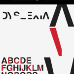
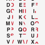
Unlike most fonts, which prioritize easy and swift readability, graphic designer Daniel Britton’s recent creation does just the opposite. Meant to raise awareness for dyslexia, the font strips letters of their qualities that make them easily recognizable. An “A” is transformed to resemble an upside-down “V”; a “D” is turned into a backwards “C.” The result is a jumble of shapes that takes extra time and concentration to interpret.
This!